The Good and Bad of CARP – Examples

CARP, which stands for Contrast, Alignment, Repetition, and Proximity, are valued design principles. Though many prioritize CARP in Instructional Design and Education, CARP is also crucial in many other settings. You can few two examples of CARP principles below.

The Good:

Screen Shot 2020-02-23 at 10.10.03 PM.png

ATD’s website has great contrast, repetition, alignment, and proximity. The red branding is used across the site, fonts and sizing are consistent, and the text is easy to read. This site is visually appealing.

The Bad:

Screen Shot 2020-02-23 at 10.16.14 PM.png

Although I’m typically Costco’s number one fan, their website could use some work. In this screenshot, we see that one panel has four images, one has three, and another panel has one image. The text is different sizing and the prices are bolded. Though this is really advertising sales, the layout is harsh and distracting. In some cases, the colors are blue on blue (which can be difficult to see for accessibility purposes) and in another it’s red on blue. There is some alignment on the borders and within each horizontal pane, but otherwise the alignment is distracting. Costco could definitely do better!

Utilizing CARP Principles in Instructional Design

When designing for an audience, it’s crucial to keep CARP principles in mind. CARP, which stands for contrast, alignment, repetition, and proximity, are all key elements to creating a visually appealing product. Whether you are designing slides, handouts, infographics, or guides, these principles will help ensure that your products look professional.

Contrast allows you to highlight key information and also helps to ensure your viewers can see the content. One of the best examples of this is black text on a white background. It wouldn’t make much sense to have yellow text on a white background. It’s nearly impossible to see.

Alignment ensures that text and images have proper placing. In many ways, alignment can create a relationship between images and text. I typically think of alignment as a grid. Items should have some horizontal and vertical structure.

Repetition is the use of color, text, and images throughout a product. This can help highlight important features and creates cohesion. I often think of this as branding in many ways.

Proximity looks at the spacing and grouping of items. Objects that are close together typically means that the objects are related. Text or images that are separated from each other signify a more distant relationship, or no relationship at all. White space is a good thing, use it to your advantage.

It’s crucial that each of these principles are applied when designing content. Otherwise, the product risks looking unprofessional. I tend to focus most on alignment. Nothing irritates me more than a title that isn’t aligned correctly with text. My eyes typically navigate towards images and text that are not aligned appropriately.

I’m a firm believer that visually appealing content provides the opportunity to further engage learners. Nothing is more unsettling, and distracting, than a product that’s been slapped together last minute.

Creativity and Innovation in Adams 12

Last spring, I applied to participate in the Adams 12 Five Star Leadership Academy. The Academy meets every month and learns about a different topic during each meeting. Some topics include: Safety & Security, Funding, and Standardized Testing & Assessments. Today we had the opportunity to tour three different schools. We visited STEM Lab, Bollman Technical Education Center, and Stukey Elementary.

It is so neat to see how innovative and creative our district is becoming to accommodate all student interests and needs. Here are a few photos from my time throughout the program. I haven’t been on a school bus in quite some time… so that’s always fun too!

We need more programs that allow students to fuel their passions.

Applications for the Adams 12 Five Star Leadership Academy will open in the coming months for next year. For those interested, you can find more information here: https://www.adams12.org/parent-groups/leadership-academy


Drawing Toast – The Art of Imperfection

This week I viewed the Ted Talks Draw more, together and Why people believe they can’t draw – and how to prove they can. Drawing can be a difficult task, especially when most individuals would claim they can’t draw. Both of these Ted Talks addressed the idea that people can draw. It’s all a matter of perspective.

Growing up, I never considered myself talented with art. I just didn’t have the skills need to draw. The one crafty pastime I would pursue was cross-stitching. Cross-stitching took all of the creative work and decision making out of the artistic process. You simply followed a grid and a pattern. Needless to say, I avoided anything with a pen, pencil, or marker. These Ted Talks allowed me to draw just for fun… with no strings attached.

In Draw more, together, Ole Qvist-Sørensen notes that “We can take photos of the past. We can draw the future”. This visual process is useful in both the educational and professional setting. While designing my first infographic, I sketched out sections before working in Canva. This allowed me to process how I wanted my infographic to look without the frustrations and limitations of learning new technology.

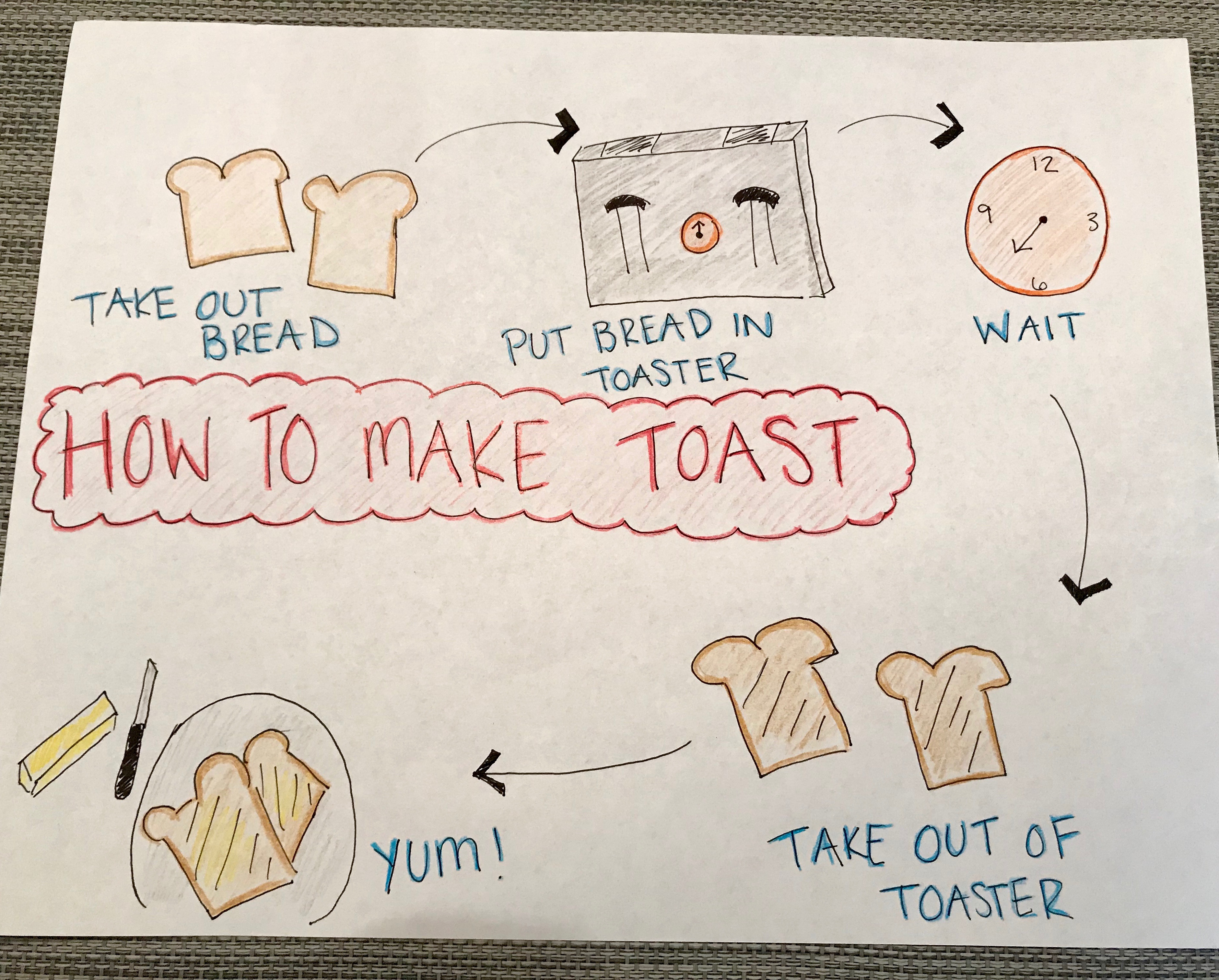
This week, I was tasked with drawing the process of making toast. This was fun! I enjoyed looking at a creative way to draw this process and present this information. At first, I was critical of my work, especially after comparing to some of my talented classmates. However, I learned that there is a huge relief in not being a perfectionist. I was excited to see how my diagram turned out in the end. You can view the image below.

IMG_7870


Displaying CARP through an Infographic

Infographics offer a creative way to present information visually to an audience. In general, their creative design and visual appeal enhance the information provided to help make these ideas “stick”.

4 Ultimate National Park Road Trips InfographicThe infographic to the left offers a good example of the four key design principles known as CARP (contrast, alignment, repetition, and proximity). As a national park lover, this infographic was not only insightful, but it displayed the four key design principles well. This helped create an engaging visual that can be easily shared.

Contrast: This infographic uses a deep gray box to outline important text information within each section. This helps contrast the information from the images and other facts that are presented regarding each featured road trip. Deep yellow title flags are used to clearly distinguish the breaks between the information, contrasting with the blues and greens used to showcase the physical maps. The contrast is strong in some spaces throughout the infographic, but would not be described as overwhelming.

Alignment: The infographic listed four different road trips that could be taken to visit many national parks. The infographic created subsections for each trip, aligning information and images that were relevant to each trip. Every image and piece of information has some relevance, or connection, to the topic. Each banner is exactly the same size and is aligned with each banner vertically down the image. The use of the zoomed map for each section that still displays relevant information to help the viewer orient themselves to that particular location.

Repetition: There are many examples of repetition within this infographic. For example, each section begins with the same yellow banner to introduce the topic of the road trip. This helps the viewer further visually distinguish each section of the infographic. Another example of repetition is the use of the same wooden sign for each pinpointed national park and the exact same yellow car that drives down the road. Not only does this infographic utilize a visually similar map for each road trip destination, but it uses the same symbols and colors to create a unified look.

Proximity: This infographic has a good use of proximity, displaying information that relates to each particular road trip within the same section. In general, a viewer can read down the infographic without questioning which information and images apply to which featured trip. A grey backdrop is used between each section to give the same appeal as intentional white space.

Challenge the Idea of Privacy

Privacy has been a growing concern as more and more users are posting on their social media networks. There are always different guidelines and settings for each platform, making it difficult to remember how your information is shared. Though it’s easy to say that we should have stricter guidelines for securing our information, I’m not sure that would help. When we decide to post certain information online, we know that it is accessible. Even if we are strict with who we decide to friend or follow on social media, it doesn’t prevent other’s from seeing that information. People quickly forget that you can screenshot information without anyone’s knowledge. I’m guilty of it too. I know I’ve screenshot chats; I actually did it yesterday, and sent it to friends for advice. Privacy is no longer an issue for just social media, but for all the ways that we decide to communicate with others.

I don’t think complete privacy can be achieved in the online community. I think we should spend more of our energy and effort educating others and the younger generation on the impact of posting to these sites. I created a Facebook at 16 and my parents really helped educate me on what was appropriate and respectful to post. They followed my accounts and helped me learn how to navigate the online world. I think it’s safe to assume that other parents are not taking the same initiative with their children. Let’s teach people to use social media to connect with others and to always remember that the information they share is really accessible to anyone.

Tribes Take Time

I have debated the concept of tribes for many years. This is the group of people that you share a passion with, and that will support you and challenge you to be better. I’ve often thought that tribes were rather odd and intense. I believed that joining a tribe meant you were one of the most passionate and knowledgeable individuals in that topic.

My aunt Julie is this “super crazy” ultra runner. She’s finished many 100-mile races, countless marathons, and too many local races to remember. She truly is an inspiration to many. Not only does she always finish strong, but she is always smiling. Always! If you ask her how she does it, she’ll often talk about her tribe. In fact, when she reflects on her races in public posts, she always thanks her tribe and her pacers. Her tribe, or in other words, the few other avid runners that pursue racing 100 miles in under 24 hours, have inspired her and pushed her to inspire others. Each member genuinely wants you to succeed and they will do everything in their power to help you meet those goals. She’ll always say “I couldn’t do it without my pacers and my tribe”.

Finding tribes can be hard. Lately, I’ve been trying to branch out and meet new friends. In particular, I’ve been searching for a good group of runners to join. I recently decided to attend a “Girls Night Out” event at the local running store. This was a big step for me because I knew this would take me outside of my comfort zone. There was food, prizes, and a bunch of lovely ladies who enjoyed running.

There was one problem. I was the newbie and most of the other ladies knew each other well. They had run together, shopped together, and spent time getting to know and invest in one another’s goals. It felt clear to me that I was an outsider.

There was one woman who had approached me and introduced herself. We hit it off from the beginning. It only took one person to make me feel welcomed. She asked about my goals, where I lived, and where I wanted to run. She was genuinely curious about my progress and goals. What started as an awkward and uncomfortable event, quickly become more enjoyable.

As I’ve reflected on my experience with finding tribes, I am reminded that this can feel like work in the beginning. Relationships take time and finding your tribe can take even longer. I’m thankful for the friendly faces and for the woman who was brave enough to connect with a girl who felt alone and uncomfortable. It’s those small interactions that really make all the difference.

The Unintended Distraction of Phones

The debate on how cell phones are impacting our lives continues to be lively. Personally, I have struggled to learn the discipline to use my technology productively. In fact, I’ve checked my phone three times since I started writing this post. My phone has literally become an extended body part. Some of my favorite hours of the day are when I’m running and I leave my phone in the car because “it’s too heavy” and “it’s too distracting”. What is it that makes us so addicted to staying connected? Perhaps it’s our fear of missing out (FOMO). Then again, sometimes it just seems to be for no apparent reason.

I recently read an article by Nicholas Carr posted in The Wall Street Journal titled “How Smartphones Hijack Our Minds”. I’d recommend the read. We all know phones can be a distraction, but this article digs into the severity and persistence of the problem. As one example, according to data collected by Apple, the average owner pulls their phone out and uses it around 80 times a day.

After reading the article, I decided to test myself. As an Operations Trainer in training, I left my phone face up for an hour. Without even thinking about it I actually grabbed for my phone 3-5 minutes after putting it down in the first place. What I noticed was that grabbing for my phone, regardless of if I had received a notification or not, seemed like an automatic response. I then checked my phone around 10 times the next hour, mostly just lighting the home screen to see if there were notifications or not, but sometimes actually opening apps and checking email. I was surprised that my phone was such a distraction in my professional life. I even tried to turn the phone face down, but it still seemed to be just as distracting. What I noticed was that I was actually bored every time I checked my phone. I had been through the training once before already and had mentally checked out for certain sections without realizing it. The second I felt like I could take a break, I checked my phone. I even carried it with me anytime I left and anywhere I went.

I ultimately decided that having my phone nearby, even if it wasn’t vibrating or sending notifications, was just as distracting as actually being on my phone. I’m sure that I am not the only one who has this experience. This reminded me of the importance of creating an environment that is engaging, especially when training. If I see trainees checking their phones, I’ll be sure to re-evaluate how the material is presented

To read the article by Nicholas Carr, click here.